Printed from acutecaretesting.org
January 2011
ROC curves – what are they and how are they used?


The term ROC stands for Receiver Operating Characteristic.
ROC curves were first employed in the study of discriminator systems for the detection of radio signals in the presence of noise in the 1940s, following the attack on Pearl Harbor.
The initial research was motivated by the desire to determine how the US RADAR "receiver operators" had missed the Japanese aircraft.
Now ROC curves are frequently used to show the connection between clinical sensitivity and specificity for every possible cut-off for a test or a combination of tests. In addition, the area under the ROC curve gives an idea about the benefit of using the test(s) in question.
HOW TO MAKE A ROC CURVE
To make an ROC curve you have to be familiar with the concepts of true positive, true negative, false positive and false negative. These concepts are used when you compare the results of a test with the clinical truth, which is established by the use of diagnostic procedures not involving the test in question.
TABLE I : Comparing a method with the clinical truth
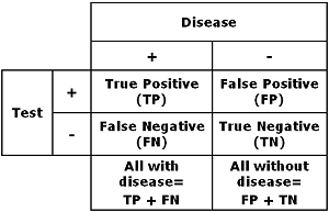
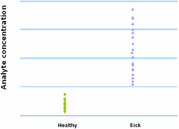
Before you make a table like TABLE I you have to decide your cut-off for distinguishing healthy from sick.
The cut-off determines the clinical sensitivity (fraction of true positives to all with disease) and specificity (fraction of true negatives to all without disease).
When you change the cut-off, you will get other values for true positives and negatives and false positives and negatives, but the number of all with disease is the same and so is the number of all without disease.
Thus you will get an increase in sensitivity or specificity at the expense of lowering the other parameter when you change the cut-off [1].
FIG. I : Cut-off = 400 µg/L
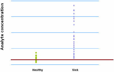
FIG. II : Cut-off = 500 µg/L
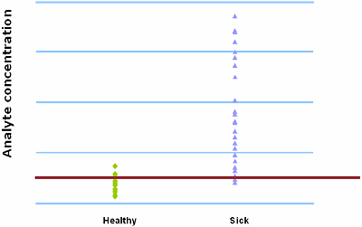
FIG. I and FIG. II demonstrate the trade-off between sensitivity and specificity. When 400 µg/L is chosen as the analyte concentration cut-off, the sensitivity is 100 % and the specificity is 54 %. When the cut-off is increased to 500 µg/L, the sensitivity decreases to 92 % and the specificity increases to 79 %.
An ROC curve shows the relationship between clinical sensitivity and specificity for every possible cut-off. The ROC curve is a graph with:
- The x-axis showing 1 – specificity (= false positive fraction = FP/(FP+TN))
- The y-axis showing sensitivity (= true positive fraction = TP/(TP+FN))
Thus every point on the ROC curve represents a chosen cut-off even though you cannot see this cut-off. What you can see is the true positive fraction and the false positive fraction that you will get when you choose this cut-off.
To make an ROC curve from your data you start by ranking all the values and linking each value to the diagnosis – sick or healthy.
TABLE II : Ranked data with diagnosis (Yes/No)
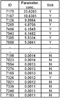
In the example in TABLE II 159 healthy people and 81 sick people are tested. The results and the diagnosis (sick Y or N) are listed and ranked based on parameter concentration.
For each and every concentration it is calculated what the clinical sensitivity (true positive rate) and the (1 – specificity) (false positive rate) of the assay will be if a result identical to this value or above is considered positive.
TABLE III: Ranked data with calculated true positive and false positive rates for a scenario where the specific value is used as cut-off
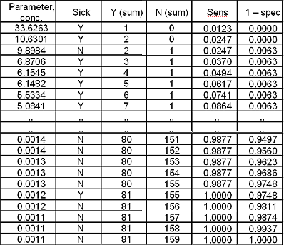
Now the curve is constructed by plotting the data pairs for sensitivity and (1 – specificity):
FIG. III: First point on the ROC curve
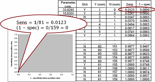
FIG. IV: Second point on the ROC curve
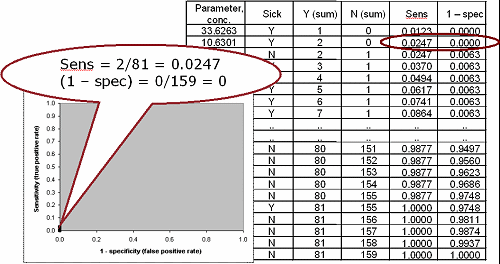
FIG. V: Third point on the ROC curve
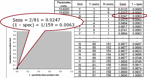
FIG. VI: Points #50 and #100 on the ROC curve
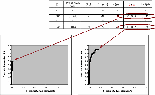
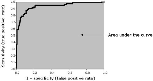
FIG. VII: The finalized ROC curve
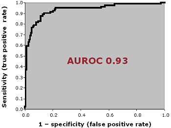
AREA UNDER ROC CURVE
The area under the ROC curve (AUROC) of a test can be used as a criterion to measure the test's discriminative ability, i.e. how good is the test in a given clinical situation.
FIG. VIII: Area under ROC curve
Various computer programs can automatically calculate the area under the ROC curve. Several methods can be used. An easy way to calculate the AUROC is to use the trapezoid method. To explain it simply, the sum of all the areas between the x-axis and a line connecting two adjacent data points is calculated:
| (Xk – Xk-1) * (Yk + Yk-1)/2 |
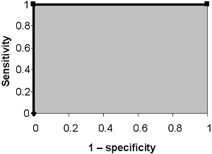
THE PERFECT TEST
A perfect test is able to discriminate between the healthy and sick with 100 % sensitivity and 100 % specificity.
FIG. IX: No overlap between healthy and sick
It will have an ROC curve that passes through the upper left corner (~100 % sensitivity and 100 % specificity). The area under the ROC curve of the perfect test is 1.
FIG. X: ROC curve for a test with no overlap between healthy and sick
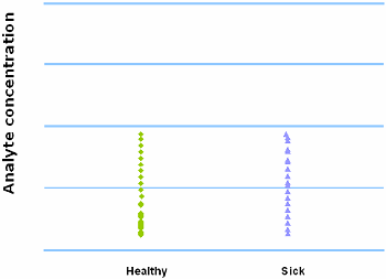
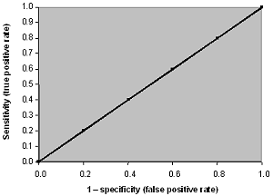
THE WORTHLESS TEST
When we have a complete overlap between the results from the healthy and the results from the sick population, we have a worthless test. A worthless test has a discriminating ability equal to flipping a coin.
FIG. XI: Complete overlap between healthy and sick
The ROC curve of the worthless test falls on the diagonal line. It includes the point with 50 % sensitivity and 50 % specificity. The area under the ROC curve of the worthless test is 0.5.
FIG. XII: ROC curve for a test with complete overlap between healthy and sick
COMPARING ROC CURVES
As mentioned above, the area under the ROC curve of a test can be used as a criterion to measure the test's discriminative ability, i.e. how good is the test in a given clinical situation. Generally, tests are categorized based on the area under the ROC curve.
The closer an ROC curve is to the upper left corner, the more efficient is the test.
In FIG. XIII test A is superior to test B because at all cut-offs the true positive rate is higher and the false positive rate is lower than for test B. The area under the curve for test A is larger than the area under the curve for test B.
FIG. XIII : ROC curves for tests A and B
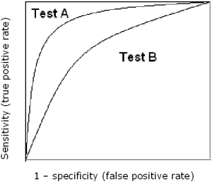
TABLE IV : Categorization of ROC curves
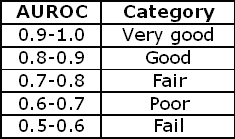
As a rule of thumb the categorizations in TABLE IV can be used to describe an ROC curve.
References
- CLSI/NCCLS document EP12-A2 User Protocol for Evaluation of Qualitative Test Performance; Approved Guideline 2nd Edition. Vol. 28 No. 3. 2008
References
- CLSI/NCCLS document EP12-A2 User Protocol for Evaluation of Qualitative Test Performance; Approved Guideline 2nd Edition. Vol. 28 No. 3. 2008

Acute care testing handbook
Get the acute care testing handbook
Your practical guide to critical parameters in acute care testing.
Download now
Scientific webinars
Check out the list of webinars
Radiometer and acutecaretesting.org present free educational webinars on topics surrounding acute care testing presented by international experts.
Go to webinars